Contents
If your website gets traffic but doesn’t generate leads, the issue might not be with your ads. It could be how visitors interact with the page. You might place a key button in the middle of the screen, and nobody clicks it. Or you write a strong headline, but users never scroll down to see it. Making decisions “by eye” is expensive and unreliable.
A heatmap is a tool that helps you understand user behavior. It shows which areas of a website attract attention and which ones people ignore.
In this article, we’ll explain how heatmaps work, why they’re valuable for marketers, SEO specialists, and UX researchers, and the tools you can use to visualize user actions on your website or mobile app.
What Is a Heatmap
If a website isn’t driving results, for example, it doesn’t bring in leads, the problem isn’t always poor design or weak copy. Sometimes users simply behave differently from what you expect. They don’t click the button because it’s hard to notice. They don’t read the offer because they never scroll that far. They click on an image thinking it’s a link, but nothing happens.
A heatmap is a visual representation of user behavior on a website. It shows where people click, how they move their cursor, and how far they scroll down a page. The data is displayed in colors: from “cold” (blue or green) to “hot” (yellow or red). The hotter the area, the more activity it gets.
In short, it’s a way to see your website or app through the eyes of your visitors. You’re not just looking at the interface, you’re understanding how people actually use it.
How a Heatmap Works
To visualize user behavior, you need to add a special tracking code to your website, similar to installing Google Analytics. It monitors different actions, for example:
- clicks on elements,
- mouse movements and stops,
- page scrolling,
- interactions with forms and buttons.
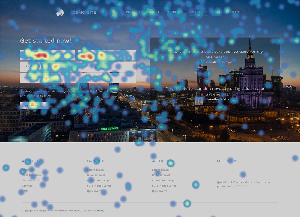
After that, the data is automatically processed and turned into a heatmap. The visualization shows which areas of the page are “hot” and which ones are ignored.
Heatmaps collect anonymized data. It’s not a recording of one specific user’s screen but an aggregated picture across many sessions.
Why Heatmaps Are Useful
Different specialists have different tasks, so the benefits of visualization manifest themselves in different ways. Here are a few examples of how heat maps help marketers, SEO specialists, and designers in their work:
| For whom | Benefits |
|---|---|
| Marketers | See which elements actually work, optimize conversion points, boost engagement, and quickly validate hypotheses. |
| SEO Specialists | Analyze behavioral signals, improve content structure and presentation, and optimize internal linking. |
| UX Designers | Test interface decisions without extra costs, adapt websites for different devices, and simplify the user journey. |
When Visualization Is a Must
There are a few common scenarios in which analyzing user behavior with heatmaps is really helpful:
- New landing page. It’s important to check whether the right elements are emphasized and if the first screen grabs attention.
- Traffic without leads. Heatmaps help you see where forms or key blocks are being missed.
- Conversion drop. Visualization makes it easier to find errors that appeared after changes.
- Redesign. Heatmaps show which elements work well and which ones create friction.
Types of Heatmaps
There are several ways to visualize user behavior. Using them together gives you a complete picture of what happens on a page.
Click Map
Shows where visitors click most often on desktops or tap on mobile devices.
The color scale ranges from “hot” (red) zones with the highest number of clicks to “cold” (blue) zones with the least activity. Areas without color indicate no interaction.
Click Map analysis helps to:
- Understand which elements work.
- Spot weak calls-to-action.
- Compare different versions of a page.
- Improve UX based on real data.
Rage Click Map
Tracks spots on the page where users repeatedly and quickly click the same element.
This behavior may indicate:
- Non-interactive elements that look clickable.
- Slow interface response.
- Technical glitches.
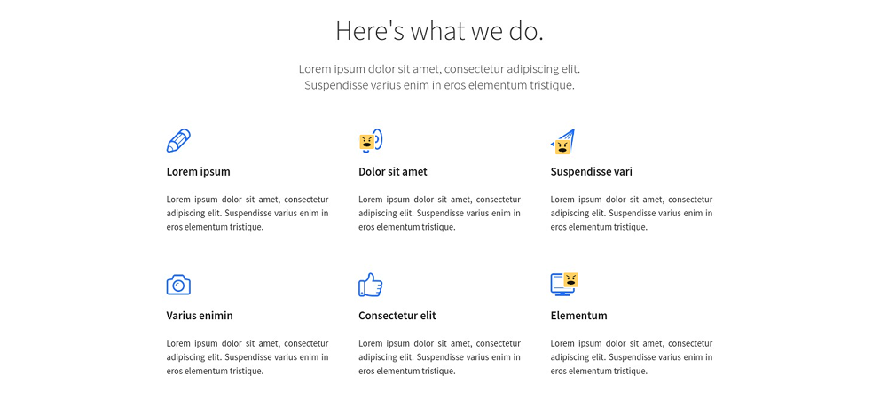
Rage clicks are highlighted with special icons, for example, angry faces. This helps you quickly spot problem areas, remove frustration, improve the experience, and increase conversions.
Scroll Map
Shows what percentage of users reach different parts of a page. “Hot” areas are seen by almost everyone, while “cold” ones are reached only by a small portion of visitors.
Scroll maps help you:
- Identify blocks that remain unnoticed.
- Check placement of key elements such as CTAs.
- Remove distractions to keep users engaged.
Move Map
Records mouse movements and pauses. It helps identify zones of interest, highlight important content, and detect navigation issues.
Engagement Zones Map
Combines data on clicks, mouse movement, and scrolling. The page is divided into a grid and highlighted by activity levels, from moderate to very high.
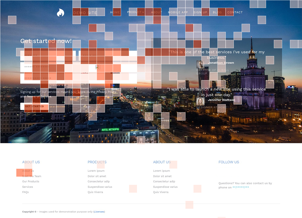
This type of heatmap gives a full picture of user behavior and helps spot the most effective elements in seconds.
Tools for Creating Heatmaps
| Tool | Key features | Special options | Pricing |
|---|---|---|---|
| Microsoft Clarity | Click Maps, Scroll Maps, Area Maps, Engagement Maps | User segmentation, before/after comparisons, mobile app heatmaps, GA4 integration | Free |
| Hotjar | All heatmap types, including Rage Click Map and Engagement Zones Map | Session recordings, updated maps after changes, period-to-period click comparison, mobile support | Free plan available; paid plans from €32/month |
| Crazy Egg | Click Maps, Scroll Maps, Confetti Map, Overlay Map | A/B testing, breakdown by devices, traffic sources, and UTM tags; detailed data for each element | 30-day free trial; then from $29/month |
| Smartlook | Click Maps, Scroll Maps, Move Maps | Filters by device, country, source; session recordings; heatmaps for websites and iOS/Android apps | 30-day free trial; then from €55/month |
How to Get Insights from Heatmaps
A heatmap is a snapshot of behavior for a certain period, and it shows trends rather than isolated actions. One person may click an element by accident. But if hundreds of people do the same, it’s worth investigating.
To make objective conclusions, compare:
- visualizations before and after website changes,
- different pages with the same goal,
- mobile and desktop versions.
Each page has its own purpose: a lead form, a sale, a registration, or a subscription. When reading a heatmap, ask yourself:
- Do users actually see the target action?
- Do they scroll down to reach it?
- Do they click where you expect them to?
If the answer is no, look for distractions and fix them. You may need to remove unnecessary elements, change the layout, or add emphasis.
Red does not always mean “good,” and blue does not always mean “bad.” For example, a “cold” contact form at the bottom of a page can be fine if the same form is placed in the middle and users are submitting it there.
Heatmaps show what visitors do, but not always why.
- Compare and contrast with Google Analytics data: pages with high bounce rates or low conversions.
- Use session recordings: they show which elements confused users.
- Set up goals and events: this helps track which elements drive results.
Once you notice a pattern, don’t jump to conclusions. Create a hypothesis and test it:
- “The form is too low → move it higher.”
- “The button is not noticeable → make it brighter and add text.”
- “Users click on a non-clickable headline → add an anchor link.”
After making changes, run heatmaps again. Comparing “before” and “after” is the foundation for improving the interface.
Key takeaways
Heatmaps help you see your interface through the eyes of real users. They are not a replacement for analytics, but they make data more visual and easier to interpret.
With heatmaps, you can:
- Understand where people click, what they read, and which elements they ignore.
- Quickly find errors such as broken forms, distracting banners, or “lost” buttons.
- Increase conversions without a full redesign — sometimes moving a button or shortening text is enough.
- Improve SEO by addressing behavioral signals.
Getting started is simple. Connect a tool like Microsoft Clarity, collect at least 500–1000 sessions, and look for deviations from expected behavior. Make minor adjustments and check the results.
Heatmaps help you ask the right questions: Where does attention drift? What prevents users from completing a form? Which elements complicate the path to the goal? The answers are often not in raw numbers or creative assets, but in how people interact with your site or app.
